The Discover Lite toolbox, to the left-hand side of the canvas, allows you to either select the visualization type to apply to your discovery; for example, making a grid into a pie chart, or a line chart into a set of gauges; or it allows you to make use of the Auto Recommend feature that chooses the most appropriate visualization type for your data on your behalf.
In Discover Lite, the toolbox provides visualization controls. For information about the other features available in the workspace, see Discover Lite Workspace.
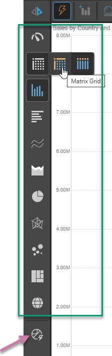
Toolbox
Pyramid offers dozens of visualization types to choose from, depending on how you want to present your data. The visualization types can be selected from the toolbox (green box below):
Selecting a visualization type
The process of choosing a visual is very straightforward in Discover Lite:
- Click the required visualization type in the left-hand Toolbox. Where the selected visualization type has several variants, a submenu opens allowing you to make a further selection.
Tip: Hovering your cursor over the selection shows the name of the visualization type in a pop-up.
Auto Recommend
Alternative process. Click Auto Recommend to prompt Pyramid to select the most appropriate visualization type for the data that is currently added to your visual. Right-click to select from a set of recommended visualization types. For more information, see Auto Recommend in Discover Lite.
Available visualization types
To learn about each of the visualizations available, follow the links below. In the linked documentation, you may disregard the step-by-step instructions on building visuals; these steps apply to report-building in Discover Pro, and are not relevant to the Discover Lite experience.
Note: The following list is annotated to indicate any visualization types that are not relevant to Discover Lite.
KPI charts
KPI charts are used to visualize your KPIs as a gauge or bullet chart. You can typically choose from two KPI chart types:
- Gauges
- Bullet chart (Discover Pro only.)
Grids
Grids are used to present data in rows and columns. You can typically choose from three grid types:
- Matrix Grid
- Tabular Grid
- Raw Grid (Discover Pro only.)
Cartesian charts
Cartesian charts plot data across two axes (a y-axis and an x-axis), which meet at 0.
Column charts
Not available in Smart Discover (Discover Pro and Lite only):
Bar charts
Line charts
- Line chart
- Spline chart
- Step line chart
- Point chart
- Lollipop chart
- IBCS-like line chart (Not Smart Discover)
- IBCS-like lollipop chart (Not Smart Discover)
Area charts
- Area chart
- Stacked area chart
- Stacked 100% area chart
- Stream area chart
- IBCS-like area chart (Not Smart Discover)
Segment charts
Segment Charts display each element of the given hierarchy as a different segment of the chart, with each element represented as a proportion of the whole, based on its value.
Radar charts
Radar charts are used to plot one or more series of values across multiple quantitative variables, which are represented on axes extending from a central point.
- Radar line chart
- Radar area chart
- Radar smooth line chart
- Radar area smooth line chart
- Radar point chart
Plotted Charts
Plotted Charts (or Multi-Variable charts) plot two hierarchies across Cartesian coordinates. They are useful in finding correlations in the data set.
Advanced Charts
Advanced Charts plot multiple hierarchies in ways that can be more interesting than a typical Cartesian chart.
- Tree Map Chart
- Hierarchical Tree Map Chart
- Circle Packing Chart
- Hierarchical Circle Packing Chart
- Sankey Chart
- Word Cloud
- Sunburst Chart
Maps
Maps plot data geographically and are an excellent way to visualize the spread of data across geographical locations.